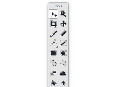
High Contrast Palette
I've been thinking about what Acorn's tool palette should look like on 10.10, as I'm not liking the way everything is currently washed out across the whole OS. So here's a stab at it.
More by Gus Mueller View profile
Like
