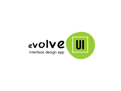
EvolveUI Logo
This was my entry for the evolveUI logo. I contributed this based off another logo . In my mind here is how I see it.
* Used a black, sketchy font and lowercase for "evolve" to represent the beginning of the UI design process. I also incremented the letters by 2px to add meaning to the word.
* Added "tag line" to define product. May just be good enough to use this in the product copy throughout the site and elsewhere.
* Added a square to represent most screen designs of today and the past. Marcin's use of the abstract shape which represents UI design for screens of the future.
* "UI" is a modern font that represents how most clients/organizations want there final projects to look and feel.
Links:
http://tribaloid.com/
https://chrome.google.com/webstore/detail/evolveui/kggdkflbniidcjejdnmfpkncdplmfofh
