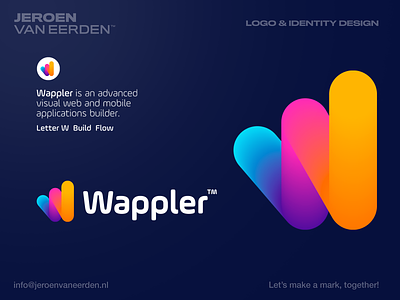
Wappler - Logo Design
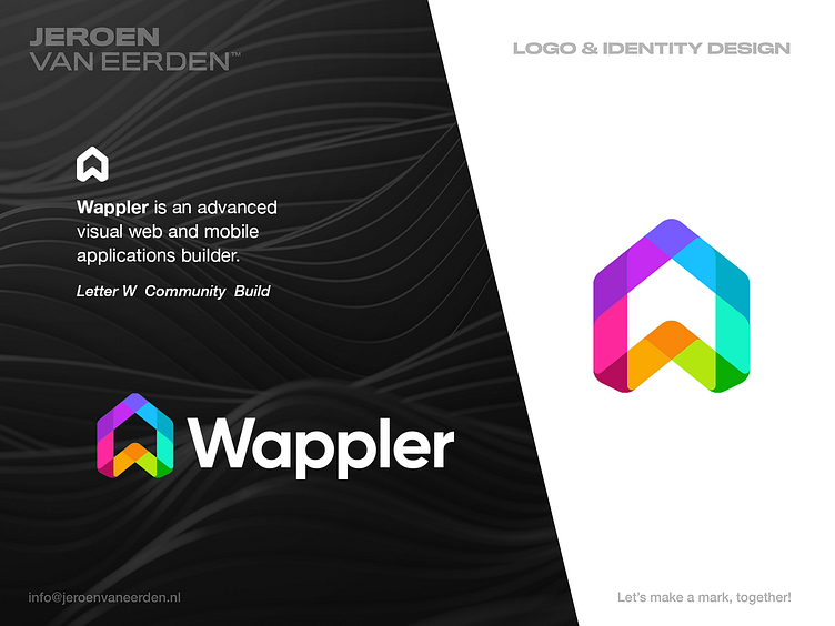
Wappler is an advanced visual web and mobile applications builder.
My focus was to deep-dive into the concept of building in a more modern and smart way. While the mark shows the letter W, it also represents the strong connection of their community (why it kinda looks like a home as well) and how they are working together fluently (overlapping elements).
The idea was to find a mix between technical/code and creativity/build.
Happy to hear your thoughts.
Interested in working with me?
Feel free to reach out via the Dribbble inbox or direct e-mail:
👉 info@jeroenvaneerden.nl