BEPURE ORGANICS Brand Identity Concept

Bepure Organics is a plant based wellness company that specializes in herbal extracts. They strive to create the purest form of plant based products for their customers by merging modern technology and organic herbs. Their aim is to educate the world about the healing power of nature and how it can help us function optimally and live a better lifestyle.
The objective was to create a clean and minimalistic logo that explained their process and products in a simple yet elegant way. The idea for the logo was for it to be self explanatory as well as captivating.
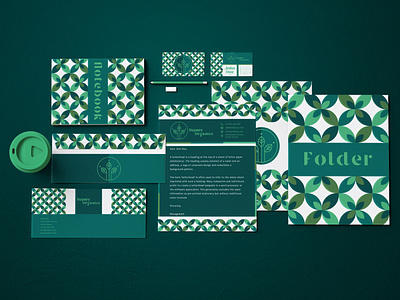
The logo consists of 3 leaves with dots right on top that represent the distinct formula that is unique to the brand and their product creation process. An earthy colour palette was crafted consisting of various shades of green that would help translate the mission and vision of the brand. The font is fluid without any rigid lines to mimick the shape of leaves.
A pattern was also developed that alligns with the visual concept and thought process. It is a symmetrical cluster of leaves with variable colours of green to represent the distinction between each plant used by the brand to create their products.
Behance Link To Project - https://www.behance.net/gallery/129243447/BEPURE-ORGANICS-Brand-Identity-Concept
Looking for a Unique Logo, Identity or Illustration for your brand?
Get in touch via DM / Email arjundhanuka8@gmail.com
Instagram - https://www.instagram.com/_monost8_/?hl=en
Behance - https://www.behance.net/monost8