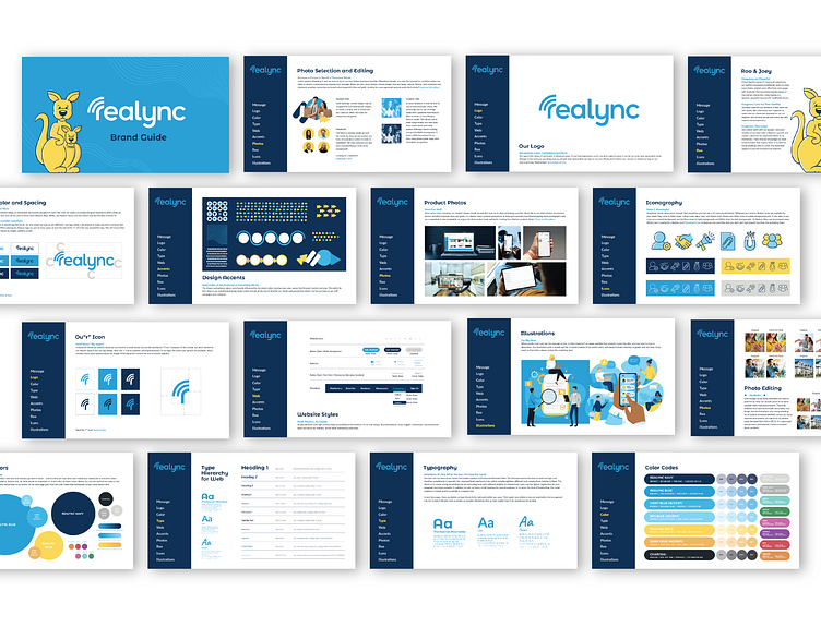
Brand Guidelines for Realync
I took Realync's logo refresh to the next level with updated branding all around.
Color:
I worked diligently on color to ensure better readability to meet WCAG standards, and to carefully translate web to CMYK and Pantone. I worked web-first with color, as we're a technology company.
Font:
Montserrat Alternates was chosen as the primary headlining font, as it was the base for to the new logo. It has a playful vibe, which matches Realync and our "friend to the industry" approach with multifamily.
Artist: Sarah Estes © Realync Corp.
More by Sarah (Estes) Day View profile
Like
