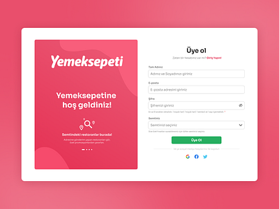
DailyUI #001 - Yemeksepeti Register Page Redesign
I have started Daily UI Challenge today and it's my first design for it.
Press "L" and enjoy the shot!
I tried to fix the errors I saw in the registration page of the original site in general. I have listed these errors as follows:
1) There is a mess on the registration page and it is very tiring for the user.
2) Input labels stay away from inputboxes and do not create a compact appearance.
3) Input placeholders are not descriptive.
4) I thought that putting a warning * sign on top of each of the form elements is very uncomfortable for the user, since all the inputs except the form element with the birth date are mandatory. For this reason, I found it more appropriate to specify only optional inputs separately.
More by Ayhan Gad View profile
Like
