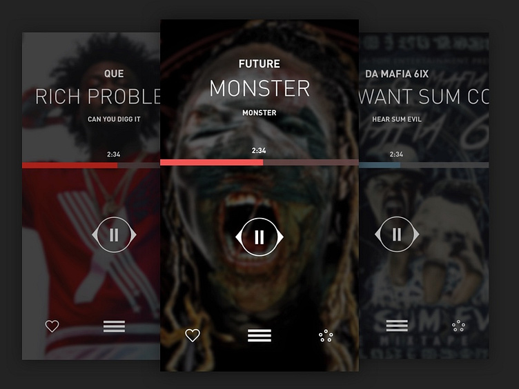
LiveMixtapes Player UI Exploration
So I downloaded the LiveMixtapes.com app for iPhone and yeah, it was a lot going on. So I decided to dive on in (in Roger's voice), and rework the app from top to bottom. Definitely felt inspired from Soundcloud's updated app and some mixtape hiphop. First important feature, the player.
For the player, I wanted to simplify it and definitely make it easier to play next songs. So I tried out a gesture where you drag the "control circle" to the left or right to seek/skip. Drag and hold, you seek thru the song. Drag the circle to the edge of the screen and let go will skip to previous or next track. Kind of that Mailbox delete/archive gesture feel.
To view the track listing, you just swipe up from the bottom and for extras like shuffling, sharing, etc, there's this little pentagon shapes icon I made of circles, which of course, enlarges with options to click on.
More coming soon. (Any feedback is recommended. I love feedback. Thanks!)
