Community App Exploration
Hi Dribbblers 🏀
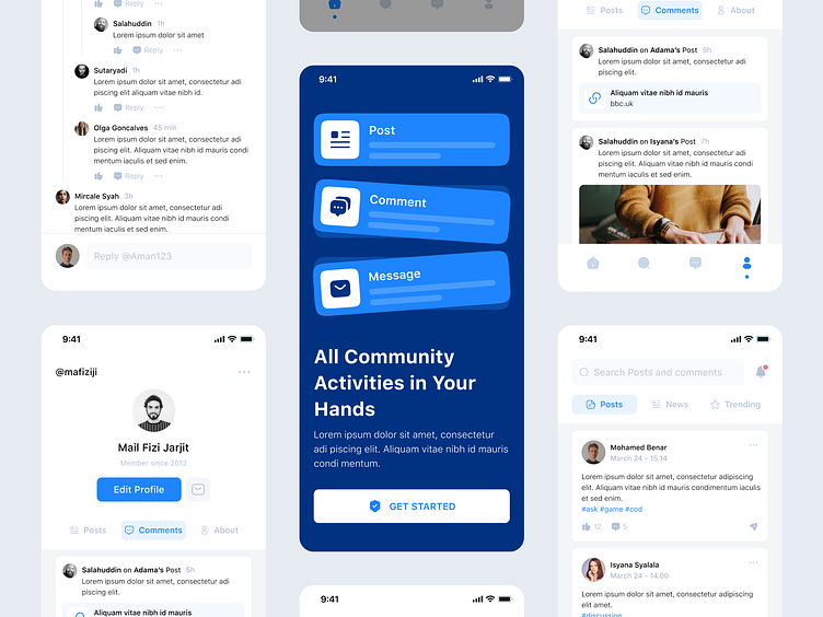
This is my exploration of a Community Mobile App
What do you think?
Let me know in the comment section below and don't forget to leave a like to show some support! Thanks! ✨
⌛️ The Process ⬇️ ⬇️ ⬇️
I started by making the wireframe after collecting the moodboard. I then turned the wireframe into a mockup design using design principles and guidelines.
📱 Screens ⬇️ ⬇️ ⬇️
I designed four pages for this exploration. Onboarding page, the page a user sees when they open the app for the first time. Profile page, which contains the user's profile, posts, and comments. Comment page, a page where users can leave and reply to comments. Homepage, this page contains posts, news, and trending items.
📲 Cards ⬇️ ⬇️ ⬇️
🆎 Typography and Colors ⬇️ ⬇️ ⬇️
🔥 We are available for new projects! 🔥
📪 Email: hello@vektora.studio
🎯 Skype: Keep in touch 😀
🌐 Website : Vektora.studio
👋 Instagram: Vektora.studio
🛍️ Ui8: Vektora Shop
💰Gumroad: Vektora Gumroad
🏄♀️ Behance: Vektora Behance
More by Vektora View profile
Like


