Valvoline Case Study


I got my oil changed yesterday and was inspired to reimagine the Valvoline Identity. It's been around since the 60's, maybe time for a little reinvigoration?
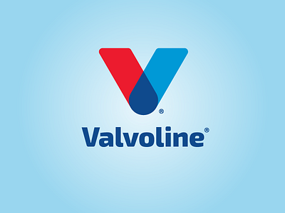
I used the same convention with a twist, now the iconic V combines to create a drop, symbolizing their famous product, oil. The new, more youthful type helps revitalize the brand's feel while maintaining the same recognizable appeal.
I included some grid & logic to the build, check it out in the attachments.
I would love to hear your opinions.
Like it or not, it was a fun exercise.
Cheers.