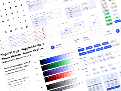
Design System For Payment Platform 💰
This is a design system I worked on for an electronic payment platform. I started out using Material Design 3 to create a tonal color palette based off of the brand colors.
When first starting out with your design system, start small —> big.
The smallest level of complexity in your system will be your constants like the hex values and font sizes. In a modern design system, the ideal way to organize your constants is with design tokens, which I am still getting the hang of and just started to use them within my designs :) Design tokens, as I have spoken about before, are essentially the nicknames you use for the constants in your app, they are the single source of truth to name and store a design decision.
Here is a talk discussing tokens, I recently listened to by Asana.
⭐️ 👩🏼💻 🌈
👉🏼 The Business Case For A Design System
Want to work with us? Our team is available! Visit:
Keep in touch and check out our recent work and news 💜
Join us on:


