Depth of Translucence in Stylish App
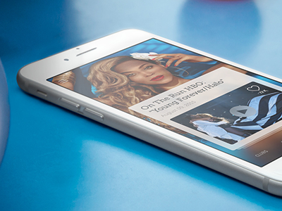


Recently I've been working on a new project for celebrities. I was trying to keep the interface clean, polished and vibrant in colors. Also I managed to achieve a "visual depth" effect by using blurred images and pseudo-3D cards to lay out the content. Minimalistic icons, rounded corners, rounded fonts in the menu and slab serif font for headers and dates - all of these contributed to the app's fancy look and feel. The celebrated user can easily add a high quality background picture and personal branding to his/her account.
Let me know if you guys have any questions or/and comments about this piece of work!