Google Inbox Re-Design
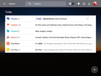
Been loving google inbox but I felt like it lacked some depth and color. The gray background in particular was visually displeasing to me.
Change List:
- Photo Background
- Transparent Nav
- Reduced padding around message icons
- Reduced Section Title Left Padding, Increased font-size, white color
More by Kevin Martin View profile
Like
