visualize the time period that stay in company
I'm woking on an app use iBeacon to automatically log the time that staffs stay in company, and it comes interesting to design a way to visualize it.
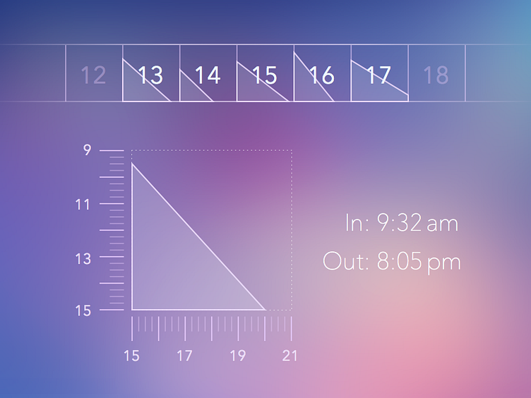
This is one of the ideas I've thought about. I think in the main calendar view people don't care about the detailed time, but just to take a quick brief look. The graph below shows how it works. The triangle is used to show the time one 'covered', the time one enter and leave company.
I'd be appreaciated if you could give me some feedback! :D