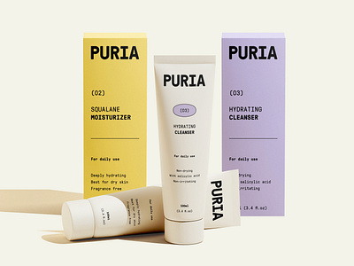
Puria Packaging
Hello Designers!
Final product from a recent exploration that I made this past month, I was researching monospace typography and decided to make a skincare Brand Identity that will take inspiration from old school typewriter typography. Adding a little twist to it to make it look more fun and playful.
Now a little something about the brand.
The main goal of the company is to become one of the most natural & clean skin care companies that produce gentle skin care solutions and routines, while keeping the products at a reasonable cost. Using non-toxic, natural ingredients and non animal-testing methods (such as human cell-based tests) to make and fine tune their products. All the ingredients PURIA uses are hand-picked after a proper research and testing phase.
The font is GT Pressura Mono from Grilli Type.
Hope you like the design, comment your thoughts and critics, would love to hear your opinion. Press "L" to show some love.
You can check me out on Instagram & LinkedIn. Have a very productive week!
