Happy Hamster Case Study

I'm excited to announce that I too was selected as a part of the early beta group of the new case study feature. I recently wrapped up an identity and packaging design project for Happy Hamster: an Ukrainian based vegetable oil and vegetarian snacks company.
Logo Mark and Typeface
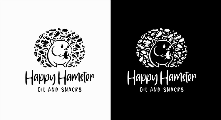
A friendly and cute hamster mascot was selected as the logo mark, since this was the obvious choice in our case: a happy hamster.
It has a sunflower seeds in his hands and it is also surrounded by various types of seeds, since the products will mainly have seeds as ingredients. For the typeface we selected a handwrite font, since we want to show ideas of femininity, elegance, and creativity. We also wanted to make the company feel more personal, and improve it’s chances of earning that all-important customer affinity.
Black & White Versions
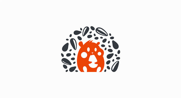
Unused Concept
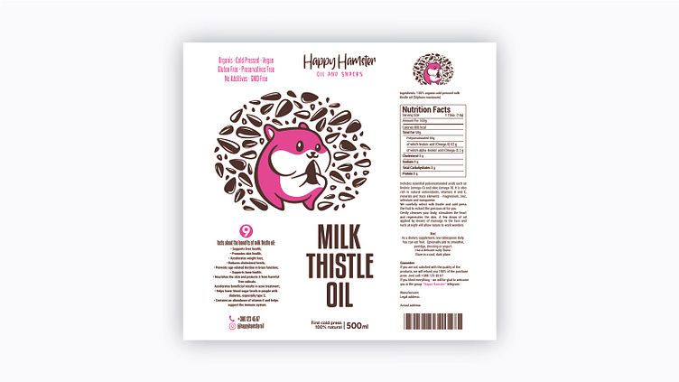
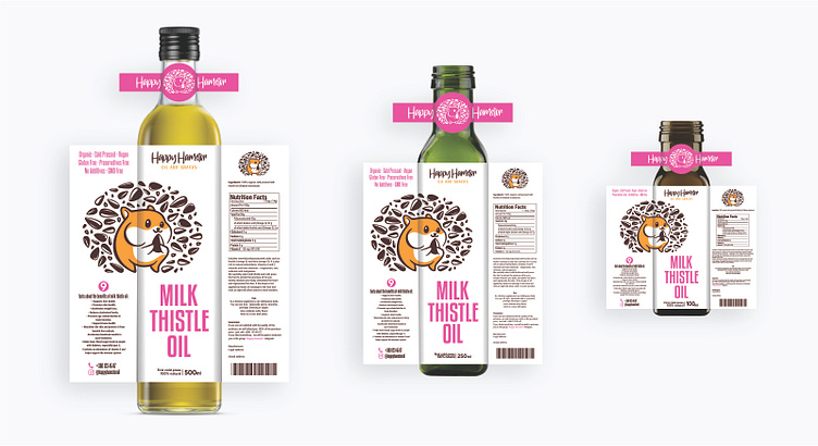
Packaging for the Oil Bottle Labels
Since we obviously wanted to remain in-brand for the oil labels, we went for modern and bold approach. Bold colors are one of the design trends today, and with reason. They remind us to be daring and resolute and accept adventures on every step we take.
Initial Concepts
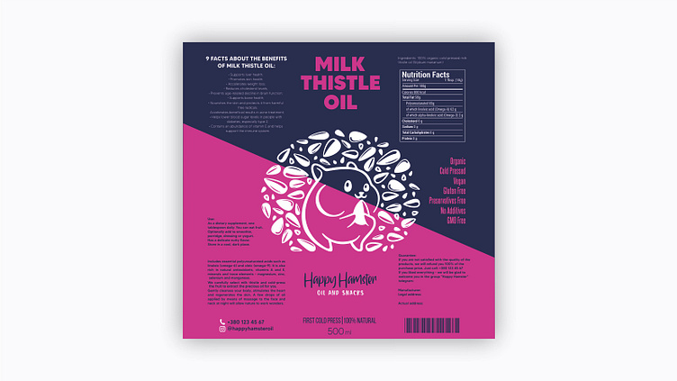

Final Version
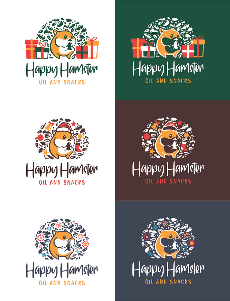
Holiday Logo Versions
We believed it was a good idea to adapt the logo design for 2 of the main Holidays: Christmas and Woman’s Day/Month.
You can make your holiday branding complete by adding a fun design to your logo. It doesn’t have to be anything huge, and preferably keeps your logo recognizable. But a small addition can add some whimsy.
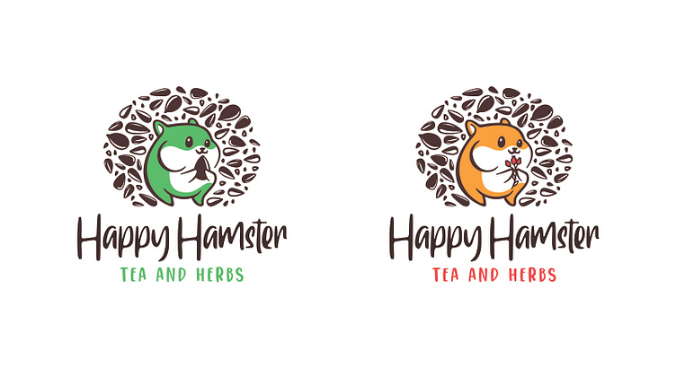
Tea and Herbs Logo Adaptation
Tea and Herbs Packaging
Since there will be more than one type of tea, we left here “Tea Name” as the name of the tea. This will be replaced in the future with the actual tea names. You can see we kept the modern and bold approach we had at oil packaging as well.


The Results
The work for Happy Hamster was a success and received a lot of positive feedback from clients and the general public.
Get in touch with me at: