Recipe UI
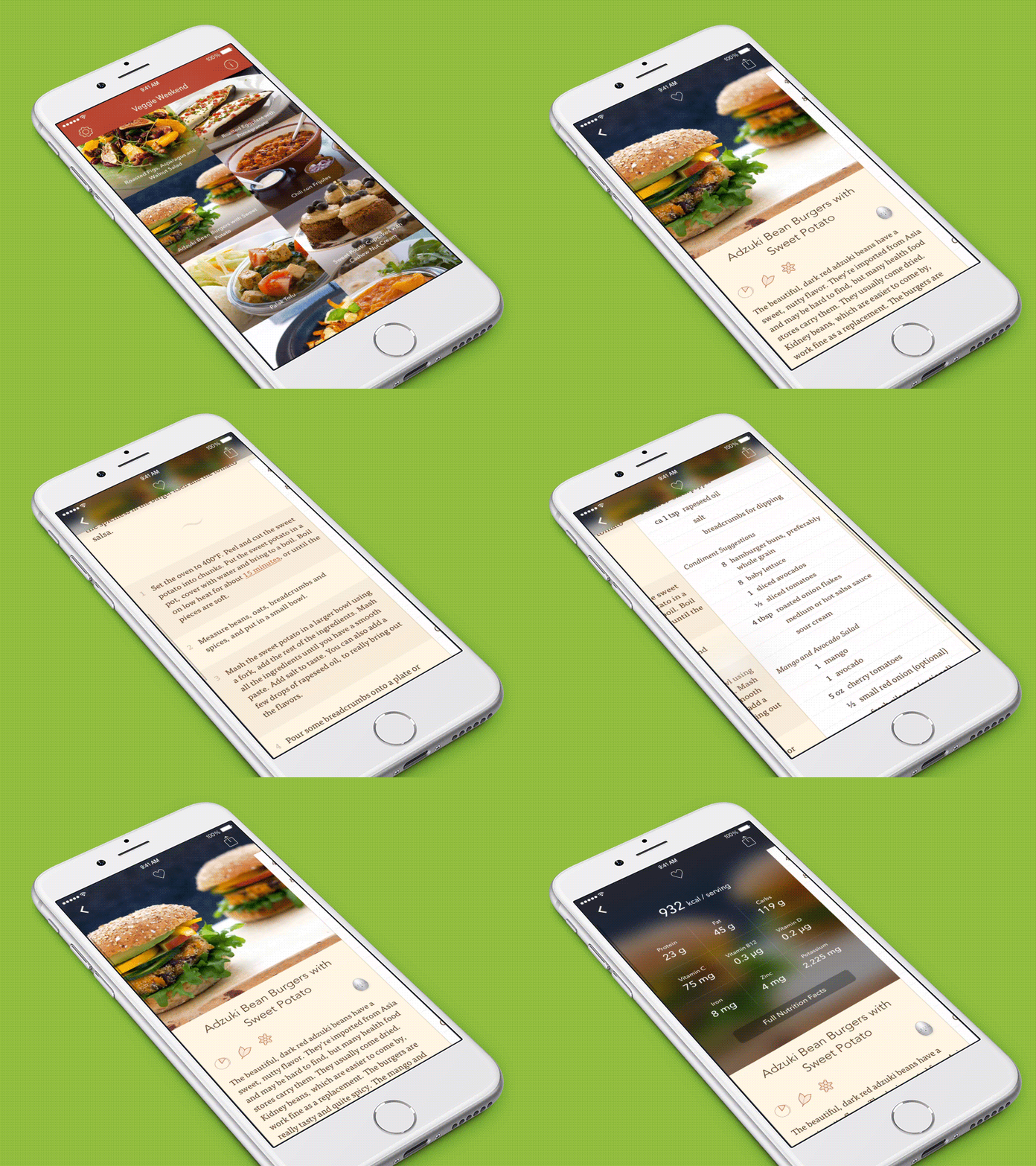
This is the flow for viewing a recipe in Filibaba's apps. This is actual screen captured footage – not a mockup – with some speed-ups to gestures.
We've focused on making the recipe photo the star and it's lifted from the grid into the recipe view. We minimize and blur it when scrolling and it effectively becomes the navbar. Pulling down on the photo zooms it in and reveals nutritional information. We onboard users to this navigational model through a number of hints that sequentially reveals the different pieces of UI as you use the app.
The app, Veggie Weekend, is showcased on a iPhone 6 Plus (new version submitted, pending approval from Apple). The larger screen makes the UI chrome recede and brings forward the content. And the photos looks phenomenal thanks to the high resolution.
Feel free to download and try the app here: https://itunes.apple.com/us/app/veggie-weekend/id625161325?mt=8
I'd be happy to hear any feedback you may have!
This shot is showcased using a template from Ramotion.
