Facebook's Timeline Redesign

This was an exercise for a job interview.
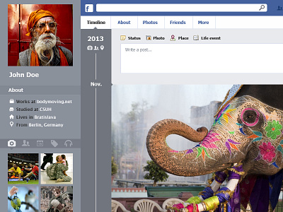
· First of all I got rid of the cover image on top. This only takes space, it is merely visual and completely in the way.
· I substituted where possible the buttons with text for icons. This does not only look better but it is also touch friendlier.
· I widened the space for the timeline itself and made a bigger difference in between fields so that it is clearer what is what. I moved the ad section to the right and the chat, friend list, and feeds to the left so that there is a more clear delimitation of your content and the ads that you might not want to see all the time. I often hear complaints from people about having too many ads and of unwanted clicks on the ads.
· The number one reason for people leaving Facebook is privacy concerns. I thought it would be nice if I could see who can see which element on my timeline. So I created another icon which I could mouse over or click and state who can see that particular post. This also makes it easier, somehow, to group elements to share with groups. So I could select multiple elements and then hide or share these from certain groups. Basically making maintenance of the timeline easier.
· On the personal information area, in my opinion Facebook is too busy. I solved this by again creating a series of icons that will vary depending on your contents of choice (photos, tags, music, places, friends). Thus with a simple click or rollover I can see the most recent or important 6, 8, 10 thumbnails of each section, instead of having to scroll down and go through every single section of contents.
· I created buttons to make a selection of what content you want to see on the timeline at that specific moment (photos, places, tags, posts...). It is possible to do this already but I dare you to go and find how to do it.
