Apple's Logo redesign exercise
This was an exercise I was asked to do for a job interview at the beginning of 2014. Redesign the logo from Apple.
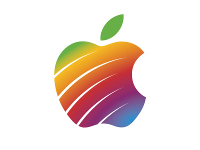
I have created a brand based on apple's logo history. For over 30 years, apple has been one of few brands that is recognizable all over the world without the need of the name next to the "icon" , and therefore should not change its symbol significantly.
I used the colors from apple's 1976 rainbow logo and used the stripe they added to their logo from 2007 to create their new brand. I believe It is still a recognizable brand and it uses their history to create a completely new image. Also it goes against the trend created after Windows 8 Flat UI design. Apple doesn't follow trends, they create them. (Windows 8 took a big bite of apple's market when released).
