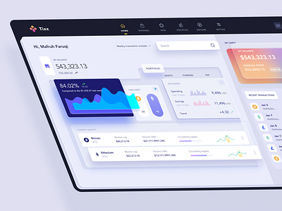
Cryptocurrency dashboard Material Design
According to the Google's Material Design principle, every component of the screen should behave like a physical object. The laws of physics should be obeyed. Every components should its own shadow according to their relative properties like motion, thickness and velocity, as it pops in and out. The components should not go throughout each other and have its own position.
It's hard to understand the difference between a Material design UI and Flat design UI (which Apple advocates) in front view, unless we look at the UI in 3 dimensional (3D) view.
The dashboard is designed by me few days ago in Figma. Today, I tried to give it 3 dimension view to show the Material design perspective.
--
Open for projects and full time remote position.
More by Mafruh Faruqi View profile
Like
