HODLIT: Cryptocurrency Exchange Platform
HODLIT, a mobile cryptocurrency exchange platform, approached The Skins Factory to do a full redesign of their mobile application’s UI & UX design.
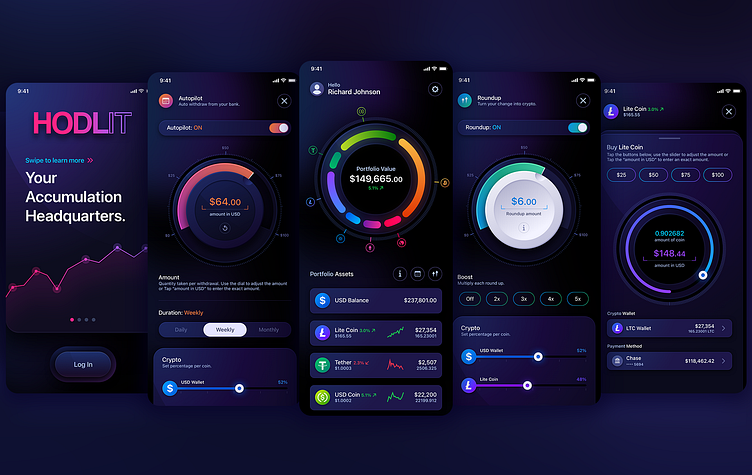
We started with a complete refresh of their onboarding process and user experience. For the visual design, we used a “panther black” base background with hints of deep purple, so the color gradients we would later add, would “pop” off the background, instilling a sense of fun while maintaining the seriousness of the platform.
Our UI/UX designers then deployed a hybrid, visual design language of 2D and neumorphic elements creating a subtle, tactile feel to the user interface while the user experience was ridiculously intuitive.
This is a truncated look at the project.
★★★★★
"The Skins Factory’s work exceeded my expectations.”
Drew Optebeke, Founder, HODLIT
SIGN UP + LOGIN SCREENS
Whenever possible we used progress UI elements to let the user know where they were in the onboarding process - whether it was pagination circles for the “Learn More” elements on the main “Sign Up” screen or the triple, wavy line progress bar at the bottom of each screen.here...
MAIN HOME SCREEN
Super vibrant colors & gradients greet the user once they complete the onboarding experience.
More than just a “pretty face,” the upper, segmented rings and their coin icons are completely interactive. When a cryptocurrency segmented ring is tapped, the center values change giving the user pertinent information for that coin. We kept the segmented rings solid in their inactive state. Once tapped, the ring becomes an outline. This denotes that the ring’s content has been “emptied” has and moved to the center area.
In the Portfolio Assets section, each row is tappable and swipeable yielding different functionalities depending on how the user interacts with them. To make sure the user experience was intuitive, we included an “i” button that when tapped, releases an info panel explaining to the user how to interact with the content.
AUTOPILOT + ROUNDUP SCREENS
These automated features allow the user to auto withdraw from their bank (Autopilot) or turn expenditures into additional crypto (Roundup). We designed neumorphic, tactile jog wheels for the users to interact with that really add fantastic visuals while still being functional elements. We used different colors for both the progress rings and jog wheels to discern one from the other.
USD + BITCOIN + CRYPTOCURRENCY: EXPANDED INFORMATION SCREENS
These screens show the information after a user taps either the USD Balance or Cryptocurrency Coin rows on the Main Home screen.
BUY + SELL + SEND:
EXPANDED INFORMATION SCREENS
As discussed previously, tapping and swiping rows on the Main Home screen yield different functionalities. The ability to buy, sell and send are as easy as swiping a finger. We used Ethereum for the main design template and designed a few other cryptocurrencies for the client to use.


