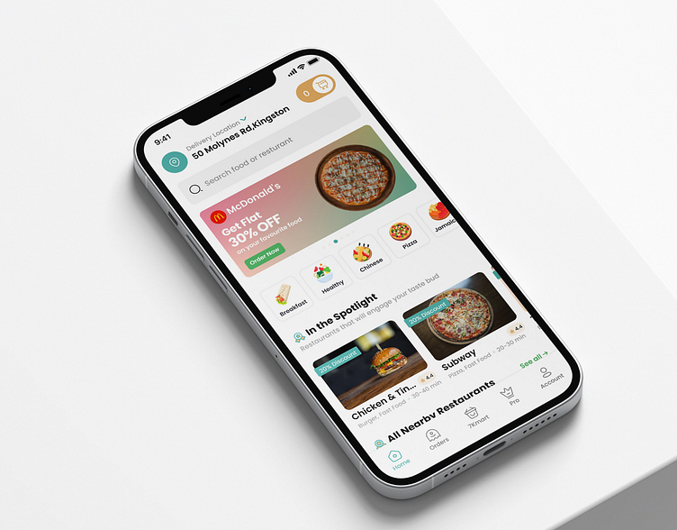
7krave food delivery app
From local startup to grown-up: building a new experience for 7krave.
7krave is now available on app store and google play . 7krave allowed me to publish this case study.
The client
7Krave is a Jamaican foodie service created by Innovative Menu Solutions Ltd. The company is located and operated in Kingston, Jamaica. The intention of 7Krave is to create a food community that connects food providers to food lovers. Their mission is to be one of the best apps, having the best customer service experience that will bring customers their orders in the shortest possible time.
Headquater Company size Industry Platforms
Kingston, Jamaica 201-500 employees Food Android, ios and web
The goal
The team at Innovative Menu Solutions Ltd teamed up with me to rethink and redesign their 7krave food delivery app. They wanted to scale up their business as an international brand from a local Jamaican food delivery app.
7Krave’s main goal was to create a consistent design language for their food community with a new and fresh look. They wanted to build a comprehensive, simpler, and much better user experience for their app users, also introducing some new features for their customers.
Service i provided
To fulfill 7krave’s goal, I was involved in every part of the project, providing a variety of services to make sure they are getting what they want. Service I provided :
Ux design Ui design Design system
User research and analysis, Interaction design, Style guide
User flow, Prototype, Components,
Wireframing. Testing and redesign. Project management.
Solution
I brought a fresh and clean look by redesigning the whole app. I also built a design system for the 7krave app that will help them to stay consistent in their future updates.
Low fidelity wireframes
Low fidelity is also known as behind the scene which comes after completing the user research, analysis and flow, Mainly low fidelity wireframes help to brainstorm ideas without designing actual design.
Design system
Build a Design system for 7krave. this will help 7krave to continue building consistent, usable designs. along with this is beneficial for developers and other employees to see and better understand how and why design decisions are made by having everything in one organized place.
Introducing the new dark and light mode
The team always wanted to bring dark mode because many customers have been asking about this feature because the dark mode reduces eye strain and allows for longer battery.
Some major features
Making a strong first impression helps to develop customer relationships. for the mobile app, the first impression is onboarding screens. where i described the major promises and security alerts.
On the home screen where i created a clean and fresh look along with bringing all of the major functionality of the app.
the hanker order feature, where customers can order food from their favorite restaurant despite the restaurant not being listed on 7krave. with live tracking mode where customers can track all stages of their orders.also on the restaurant page customers can see previous reviews and ratings
On the account tap, customers have control of their app, besides introducing 7krave wallet, gift cards, Rewards features, and more.
While designing 7krave, maintained the grid system where app can be usable in any ios or android device.
The result
We started in September 2021 and after four months of collaboration, we have successfully launched the new 7krave 2.0 in February 2022. Since then, the feedback that the 7krave team has been receiving is phenomenal. 7krave’s customers are so much happier with the new update. I am so proud to be part of 7krave’s team and to work closely with the team, especially with The Flutter way and CEO, Rory white.
For work inquiry?
📨 Email me at arianzesan@gmail.com
Design process & Free Resources - Youtube
More work on :
Twitter | Behance | Medium | Gumroad Store


