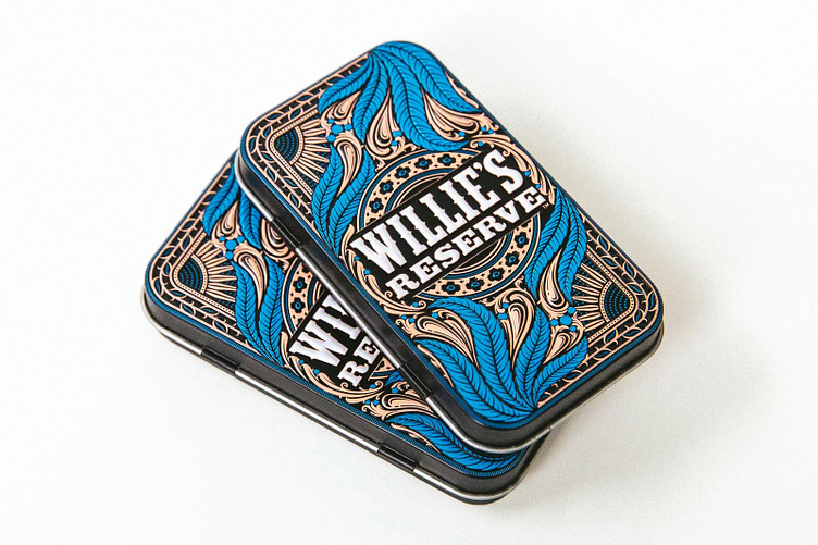
Willie's Reserve Joint Tin V2
Presenting the highly anticipated sequel to the original Willie's Reserve joint tin!
With this design it was important to me to push further in the level of technique and ornamentation I demonstrated in the previous tin design. I also thought it would be cool to borrow a few design cues from the Art Deco design period while ensuring it still felt like it lived in the world of Willie Nelson and Willie’s Reserve.
For this design I was looking at a lot of ornamental art deco type design because I thought it would be an interesting direction to take this highly detailed series.
Here's version 2 standing proudly next to the original.
I was very excited to see what kind of response this new design garners with fans of the brand.
Again for this design rough pencil sketching played a big role in the process. I started really roughly just to break out ideas and then got more refined as I went.
Here is the actual metal stamping tool used in their manufacture. So cool to see how the sausage is made sometimes!


