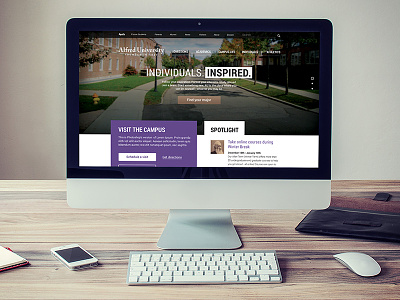
Alfred University redesign
This was done as a design exercise. This was not commissioned work. I spent a few hours using my college's website as wireframes to draft a new concept for their website. When viewing the current website, I noticed there wasn't a hierarchy of content, nor was their a primary call to action.The intent was to explore a more open layout that allows the user to easily digest the content and to provide better visual cues/drivers for applying, finding a major and visiting the campus - three items I felt were the most important action items for the intended audience.
I explored two options, one with and one without a photo. I introduced a new color palette, a subtle purple, driven from the school colors, a bronze - a more collegiate styled color to replace the current brightly saturated gold and a rich blue/dark gray that is used as a tertiary level color for type and higher level elements such as the footer and newsroom block.
See more at www.matthewnagy.com


