Save in Drive | Redesign
Ok, I'll give it a shot. Made some adjustments to Google's mobile 'Save in Drive' screens. This redesign should improve consistency, hierarchy and legibility.
---
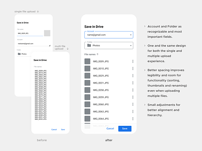
Analysis (before):
• The Account and Folder selection fields are more important than they are displayed here.
• Visual inconsistencies in alignment make this screen a bit messy.
• Buttons are not really recognizable as such and have no difference in hierarchy.
• When uploading multiple files, the long list causes the Account and Folder fields to be pushed out of sight. Nothing indicates that those fields are below. This can cause files to be saved without the user knowing in what folder or account.
• With this longer list, this screen looks like a different upload experience.
• Renaming functionality and thumbnails are gone.
• Lack of spacing or sorting makes this hard to read.
Redesign (after):
• Account and Folder as recognizable and most important fields.
• One and the same design for both the single and multiple upload experience.
• Better spacing improves legibility and room for functionality (sorting, thumbnails and renaming) even when uploading multiple files.
• Small adjustments for better alignment and hierarchy.
