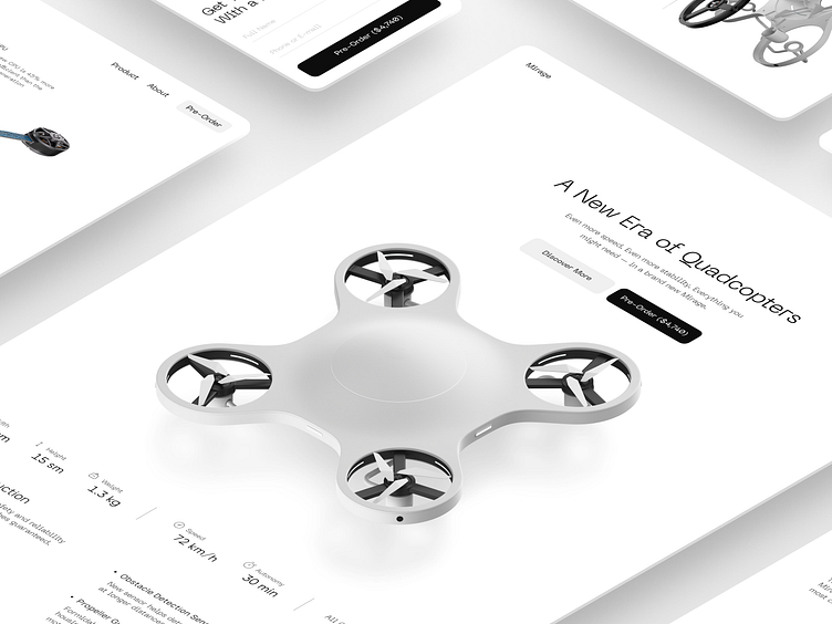
3D Quadcopter Landing Page
The principle of “more is less” applies to product design, too. This work involved the full-cycle design of the futuristic and lightweight drone made in 3D, as well as the concept for a landing page.
To bring attention to the product, we not only displayed it in the middle of the frame, but also added a subtle shadow so it would stand out even more. No bright logos or bald screaming words — let’s keep it quiet and powerful with a thin typeface, gray and black design, and buttons.
Let's collaborate!
hi@conceptzilla.com
Discover more about us at conceptzilla.com
More by Conceptzilla View profile
Services by Conceptzilla
Like
