Wendelin Pro Variable

A traditional sans serif — with that certain something — very legible
slanted stems of M
l with a slightly flared “foot”
slightly bowed stems similar to serifs on the lower case characters
slanted endings in upright fonts
rectangular endings in italic fonts on horizontal stems
OpenType features
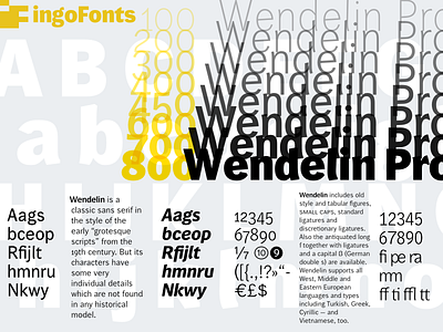
Wendelin is a classic sans serif in the style of the early “grotesque fonts” from the 19th century. But its characters have some very individual details which are not found in any historical model. The slightly bowed stroke endings which nearly look like serifs are characteristic of Wendelin and lend greater legibility to the font.
The italic weights of Wendelin are based on true italics with clearly rounder detail forms and not just slanted variations of the upright form, even though a and g retain the basic form of the upright version. Also, the italic f has a descender, the e is round, and k is open and rounder as well as r.
Wendelin Pro supports all European languages including Turkish, Greek, Cyrillic plus Vietnamese.
Several OpenType features provide access to historical forms (long s along with it’s ligatures), standard ligatures, discretionary ligatures, small caps, alternative numerals (fractions, inferior and superior numbers, circled numbers, negative circled numbers.) A set of arrows is included with Wendelin Pro, too.
Wendelin Pro features a wide range of eight weights from Thin to ExtraBold and the appropriate italics.
>> learn more about Wendelin at