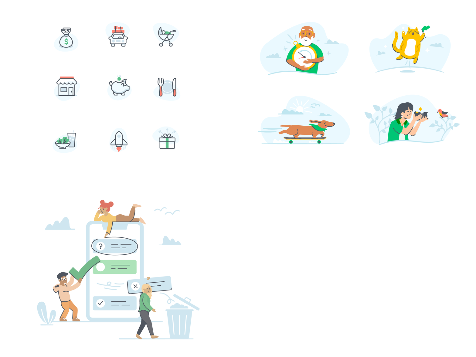
TurboTax Icon + Illustration Tiered System
TurboTax is on the search to simplify taxes and spark a little joy through the process. I was given the task of completely redesigning their visual identity system from the ground up while working in collaboration with TT's amazing design team. The objective was to bring their application to life with the use of user-friendly visuals that brought delight to an otherwise strenuous process.
This included 100's of icons for the entire tax filling application process, illustrations for the website, and glyphs for their mobile app. All of the assets were created based on a tiered systematic approach that was then outlined in a visual guidelines document for the team to build out visual assets in the future.
Tiered Design System
From ui icons to illustrations, the system builds and adds elements as the graphics get larger on the screen. The dark graphite color is the base and consistent throughout the whole system. Then pops of color and subtle blue details are added in each step as the icons progress into larger illustrations.


