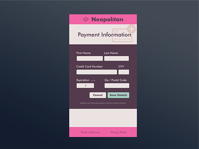
Add Payment Info - Day 2 Challenge
Day 2 of the 30-day dailyui.co challenge.
I focused on consistent spacing, hierarchical gaps between grouped fields.
A challenge with forms is a "pixel-perfect" grid layout versus a responsive and data-driven design. I've chosen to split 50/50 for name, CVV 4 characters wide, and CCN taking up the rest, Expiration and Zip using five digits and five digits with a larger gap between. Lastly, I've right justified the button group and let the button width be based on the text. I think this is a good compromise that can be localized into different languages. That is more scalable as a design system, but it isn't the most visually balanced or pleasing.
Any feedback is welcome.
More by Austin King View profile
Like
