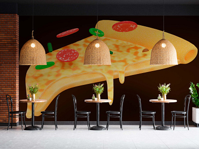
Smirnov’s pizza — Interior
The history of the project began in the learning process, with a crazy thought. How is it? The author studied Blender (software for creating three-dimensional computer graphics), thought about where to apply the knowledge gained at that stage of training, created a problem and solved it.
I am so intrigued and fascinated, because it is the very process in which it is pleasant to be: set tasks, solve them, make mistakes, collect feedback on your thoughts, and the most important and cool thing is to generate thoughts, make other people think and invent.
The 3D model of a pizza turned out to be very interesting. It combines the rules of a toy-minimalistic 2D icon and a simplified 3D model of a real object. Procedurally generated materials (thanks to the "nodes" in Blender) allow you to convey the main features of the ingredients. Dough, cheese and sausage are immediately distinguishable for viewers and the remaining elements competently decorate the entire composition, embodying the filling.
🍜 For the sake of new, you need to forget old well
Recently, you can find a large number of places that use photos of their dishes as advertising. There is nothing wrong with this, however, as customers, we may doubt the honesty of this approach. It is quite possible that the dish prepared for advertising may differ from the one served in the restaurant. Maybe the cheese will not shine so brightly, the sausage will not look so red and juicy, or the sauce will not sparkle so gently and sweetly. As customers, we are aware of: "until you try, you won't understand." It turns out that this approach is not so definite and it is worth paying attention to other solutions.
That very "toy" effect , that line between realism and convention is unexpectedly interestingly combined in this symbol of the pizzeria. It is easy to associate a brand with it, it is easy to remember (after all, the symbol is real and "digital" at the same time). Clients do not lose anything when they see this symbol as an advertisement for a place. They understand: "Pizza is served there". The taste and quality can be appreciated already at the table.
It is impossible to ignore how not the most complex 3D composition can be turned into a real decoration of the room. It is important to understand that any place is perceived by the client holistically, taking into account the design of booklets, menus, signage, posters, plaques, etc. You can't exclude one thing from the equation and hope for success.
Stunning shots make the wall unique and stylized. Any photo of the beautiful rooms presented on the concepts will not only arouse interest, but also instantly, unambiguously indicate the brand. This is an advertisement without words, actors and editing.
Interior remains in the memories of visitors for a long time. Not only design is important, but also keeping place clean, use of quality materials, level of service, etc.
Project on Behance:
