Refining Instapaper
Instapaper is Great. Really. Go download it.
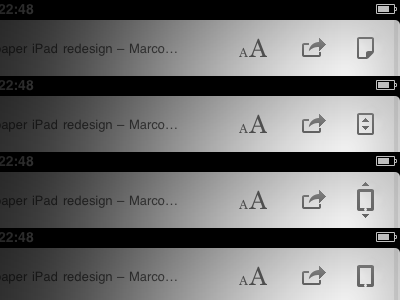
But as designer I’m always noticed some inconsistencies. For example, I dont’ like how tilting / scrolling / pagination icon in Instapaper looks and behaves. Current «Tilt icon» looks out of style. It should be flat like others. More: activate the icon and you'll see ugly generic border, that looks like a black bug on a white page. I absolutely sure that reading apps should look as clean as possible.
So I tried to resolve the problem. No borders, just pure glyphs. Download and extract the attachment to see how it looks.
What do you think Marco?
Icon.zip
500 KB
More by Alex Solonsky View profile
Like

