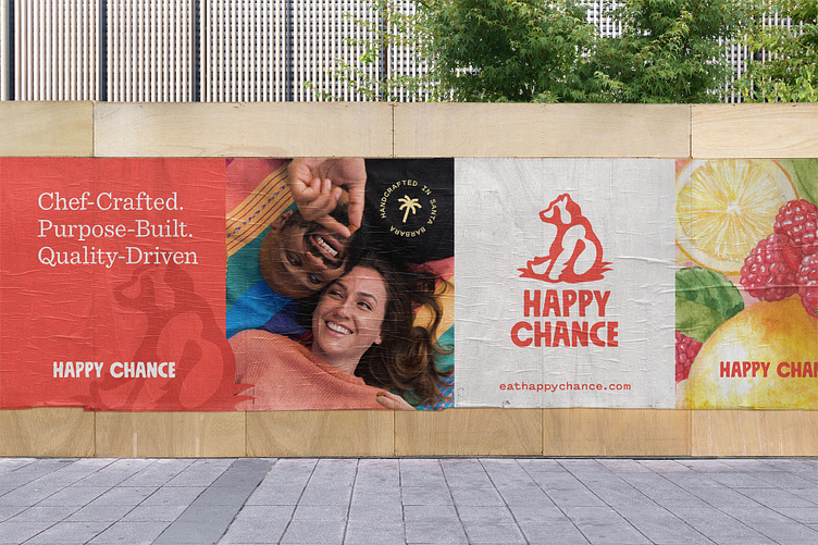
Happy Chance Case Study
I'm excited to share my first Dribbble case study! I recently wrapped up an identity and packaging design project for Happy Chance: a female-founded & led brand on a mission to bring you our chef-crafted fruit bites that are better-for-you and better-for-the-planet.
Logo Mark
The sitting bear mark was inspired by a wooden bear sculpture hugging a tree, welcoming you to the founder’s family farm, rightfully named, “Happy Chance”. A deep dive into the proportions of the bear allowed the right combination of realism and playfulness.
Packaging Design
We partnered with Anastasia Kobernyk, to create a series of delicious fruit mashup illustrations to give the packaging an enticing and delectable look. The packaging shape took on many forms throughout the process, but we always championed the Happy Chance logo mark as the primary focal point. The logo was purposefully created as a single color illustration to be able to take on the color of the flavor inside.


