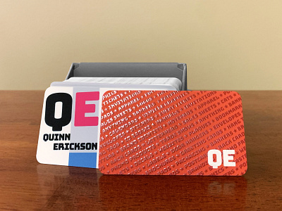
2022 ~ Year of the Business Card!
I'll be honest, I hate business cards. But, they are an excellent opportunity to put an example of your work in a prospective client's hand. As a graphic designer, I love the business card!
After the rebranding, business cards were the natural next step. I wanted this to subtly scream creativity and inspire the people who ended up with one of these in their hands. I put careful consideration into every detail of the layout. For the front of the card I made sure my brand's typeface was used and complemented it with the ever-so-classy Avenir Next typeface. Every element of this layout is aligned for a well balanced and harmonious design. My logo is bled out and skewed ever-so-slightly for that "I'm a designer" touch.
The back of the card utilizes the Z-pattern, I wanted people to look through all the services I offer then land on "QE". I chose the rich orange color because I fuckin' love it. It's also a warm inviting color with high energy. Let's get pumped about this pamphlet, Jana! I successfully combined form and function with using my services as a design element on the back of these cards. I added stars instead of bullet points because, again, let's get pumped Jana. As I was racking my brain to list all of the things I could design and produce for people I realized there was a much more simple and effective method to come up with these. I simply went to my favorite online print services provider, copied all the things they offered, and, voila! I added some other offerings and personal touches as well.
I went all out with these business cards. A premium heavyweight cardstock was used with a soft touch coating and a spot varnish was added on the back to really make these pop. Showing examples of your work will only get you so far. To actually feel, hold, touch, experience something well designed takes it to the next level! I absolutely love my new business cards.

