HCB Marketplace Search
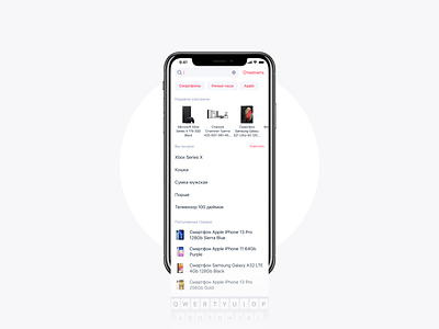
Here is an updated search experience concept that I worked on with a team at HCB Marketplace app.
Our current search experience isn't so bad, but it's pretty limited and outdated. It simply doesn't provide all the necessary features and didn't follow the modern e-commerce UX practices for search experience.
By analyzing search queries we find out that in most cases our users are struggling to find products they've already seen (repeated searches) and only 30% of queries are unique. This data told us that we can predict and improve the search experience to make it more relevant.
Here is some search metrics we wanted to achieve:
Time to click on search result;
% of clicks on search results;
% of search queries without clicks;
% of search queries that ended up with no product find;
Time between first query and click;
Time that user is spending on search page;
Number of searches per session;
a lot more...
So for the first iteration we decided to build a horizontal block with recently seen products that contains the last 10 products user visited, decreased an unnecessary accents on the search results, and added product images for popular products. As user types the query, we hide recently seen and popular products section, but show the related categories (e.x. if u searching for a Xbox, we offer you to check "Gaming consoles" category as well as "Gaming accessories") and related products instead.
