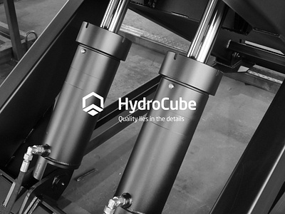
hydrocube – identity and print design
https://antongolev.com/en/cases/hydrocube
Founded in 2015, the company has been increasing its production capacity every year and is doing more than 500 projects a year, which is a serious indicator for the field.
We became acquainted with HydroCube when the management decided to scale the business and build a unified brand positioning in the market. That was the task our team took on.
We had to rebrand, develop an identity and put together a coherent image of the company, consisting of individual elements: from the logo, palette, documentation style, to the hockey team uniforms and design of the company catalog. HydroCube products are aimed at a narrow category of customers, which complicated our task, but also made it more interesting.
So, what we had at the beginning. HydroCube had disparate results from different design studios that had no overall strategy, no identity, and no supporting concept. Using them, the company was unable to communicate its values and present its brand while maintaining recognition, which was complicated by the lack of a brand book.
The main task we had was to make the brand understandable for a complex target audience from top management to the presidium of large companies. The company’s message should be accepted by its clients very accurately and clearly, and the brand position should be recognizable at a glance.
We began by conducting our own analysis of the brand – its approaches to work, products, tasks, strengths and competitive advantages. In view of the fact that HydroCube is a confident leader in its industry in the domestic market and plans to take a strong position in the Western market, we had to create a brand which would be understandable for Russian consumers and evoke a similar response from foreign customers. For this purpose, we studied in detail the specifics of branding of foreign companies that have a clearly established positioning and visual range.
In the next step, we collected the results of analytics and all the wishes of HydroCube. Based on this information we built a visual strategy. At the same time we refined the “native” logo, making it modern and recognizable through a concise and relevant color palette and key elements. HydroCube logo became clear and readable at all points of customers’ contact with the brand. It has become a reflection of the company’s reliability and technological ideas.
We identified that what sets HydroCube apart from the competition is its innovative product and superior quality. We have reinforced this perception by focusing on the details and broadcasting it throughout the brand, and it now reflects a personalized customer experience.
Then, we redesigned and created new media for the brand identity, developed layouts and appropriate rules for their use, so that brand representatives could easily interact with customers, communicating brand values. And merchandise for employees and the hockey team completed the image of a successful business player who knows his strengths and boldly conquers new markets.
We created a brand that is competitive not only in Russia, but on the European market as well. The HydroCube case is a classic example of a project in which detailed analytics combined with the client’s visual preferences played a key role. Thanks to this approach, we managed to develop a holistic image, which reflects the philosophy, identity and the main message of the company. An unobvious decision to keep the shape of the logo and adjust the palette allowed the brand to remain recognizable and breathed new life into it. The brand book we developed became a symbol of constant movement of the rapidly growing company. Now in a new and dynamic style.
