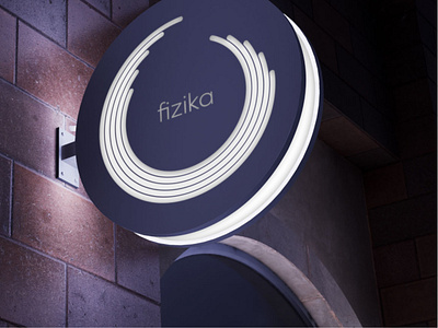
fizika – identity
https://antongolev.com/en/cases/fizika
Fizika, a startup franchise network of sports schools for complex physical development for children aged between 1.5 and 12 years, offers a unique training methodology developed by a professorship of athletes, pediatricians, teachers and psychologists.
The project equally develops five areas of physical skills: strength, endurance, coordination, speed, flexibility. And it is these components that formed the basis of the design, which allowed us to accurately convey the focus on the complex and harmonious growth of the child.
We set a goal to appeal not only to parents, but also to children as a full-fledged and independent target audience. To achieve this, we set associative colors and used simple, streamlined shapes to create illustrations for each of the five areas. Understandable and not overloaded with details, they are easily perceived by both adults and children, which allowed to unite different age groups. For easy adaptation for use in all types of rooms we have developed a pattern consisting of outline drawings of the main elements.
In contrast to the classic approach, we went backwards in creating the identity: first we set the palette, developed the graphic elements, and only then proceeded to work on the logo. The logo is also based on 5 physical skills, represented by open circles tending towards a perfect closed form, familiar to all Apple Fitness users.
We were able to show the brand values and the goals it sets for itself – the physical development of children in meaningful ways. That’s exactly how the design turned out – clear, uncluttered. The developed brand identity incorporated a mix of dynamics, development and gamification, targeting different segments of the audience.
