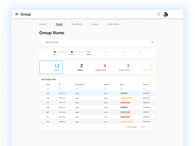
Dashboard application
What? Dashboard application created for a client.
Why? The client was using multiple legacy 3rd party applications (email, calendars, Sharepoint) so they wanted one central application to collaborate, as one. They had a lot of data, both historical and recent, that determined a lot of the decisions they made, and it was difficult to track and find and make use of. The dashboard was meant to help them track these different 'Groups' (data scrubbed for NDA purposes), and the key insights gave them these snapshots to help them make decisions quicker.
After research and testing, we iterated on the design to make it very simple yet straightforward, not blending sections on the same page and rather putting them under tabs so the user could find exactly what they needed and expected. The product owner made it a point to not force the user to have to scroll either.
How? Created in Figma.
Result? This was the final mock-up before moving on to a new role/org. This pre-dated the live production application but fulfilled the vision of the product owner.
