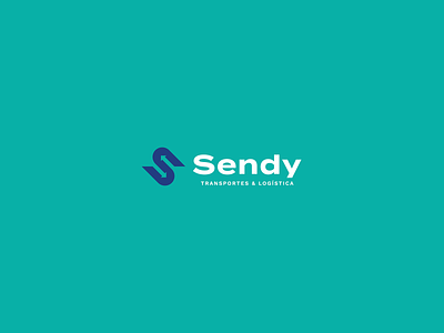
Sendy - Brand Identity Project
Visual Identity project for Sendy
THE BRAND
Sendy is a transport and logistics company that performs different types of deliveries for the Brazilian market. The business proposal is to become scalable, serving the entire national territory, being able to always provide the best service with quality and competence, offering the best delivery time options, a key factor for businesses focused on logistics and transport.
GOALS
To become a great and recognized reference in the national territory, mainly due to the fact of always providing the best and most competent delivery service, having a qualified team and a complete fleet of vehicles.
CONCEPT AND SYMBOLOGY
To build the visual identity, specifically the symbol, some elements were adopted that represent the brand name, such as the initial “S”. Taking advantage of the sinuous lines of the letter “S” it is possible to understand that its shape represents the highways and paths through which the packages are transported to their recipient. Arrows representing shipments, directions where deliveries are picked up and taken.
Take a look at the complete project at:
Feel free to reach out via DM or by Email:


