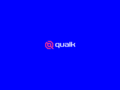
Qualk Exatas - Brand Identity Project
Visual Identity project for Qualk Exatas
THE BRAND
Qualk was born from the union of three friends who aspire to a non-traditional way of teaching Exact Sciences, like physics and mathematics. The idea is to provide students with Exact Science content through info products (courses) that prepare to universities entrance exams, in addition to private lessons that the company offers.
Through a jovial, fun, daring and relaxed language, Qualk wants to show that learning physics, mathematics, calculus and everything that the exact sciences cover in general can be fun and better understood if worked through its eminent teaching method.
CONCEPT
The concept chosen for the brand's visual identity is based on the symbolism of the portal and the sci-fi style, representing the brand, its products and services as a door that allows them to pass entrance exams. The construction of the symbol is based on the junction of the octagonal portal and the letter “Q”, which is the initial of the brand's name.
Take a look at the complete project at:
Feel free to reach out via DM or by Email:


