Bloomful - Brand Identity
Doing what we love.
Bloomful is an online mental health awareness company founded in Norway. Their focus is shifting their patients into psychological freedom and stability by going through the boundaries of poor accessibility to programs that help in these matter.
The problem is to approach people.
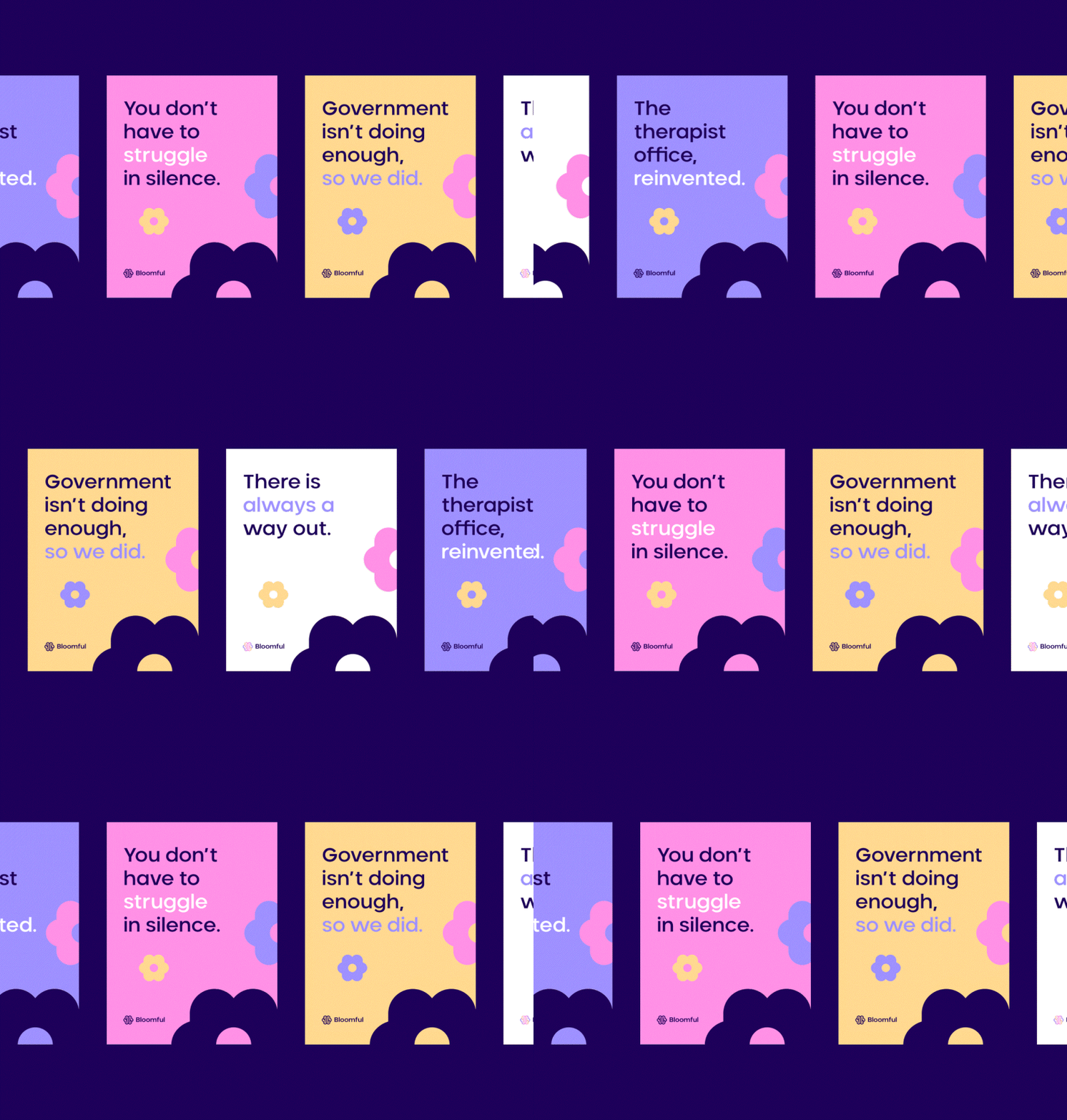
The use of pastel colors and gradients furthers the identity’s connection to growth and change. The bright shade of pink used with shades of purple & yellow conveys a burst of growth, energy, and positivity. Contrasting this with the dark purple or clear white again captures the theme of transition, and a positive personal journey. The gradients also convey the sense that this change is steady and gradual.
How I solved it.
The result of these considerations merge in a visual identity that carries the values of the company throughout every part of its construction, and gives the brand an accessible, approachable, and human feeling.


