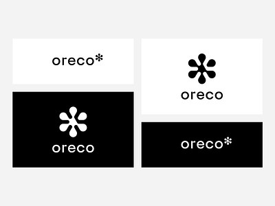
Oreco. Food distributor logo rebranding.
A new sign for a company dealing in the distribution of fresh and frozen food ❄️. The design refers to snowflake, stars, the form uses geometry, which is to be associated with solidity, repeatability and quality. Versions: horizontal and vertical for different graphics purpose and use in layouts.
Need PRO logo? Catch me: beetroot.pl
More by Beetroot Graphics • Łukasz Kowalik View profile
Like
