404 Page | Experiment UI
Hi there, today I have an opportunity to finish my #008 daily UI challenge from dailyUI.co and my experimental project, TRAVELO website.
Design Hint:
Design a 404 page. Does it suit the brand's style? Is it user-friendly? It might sound mundane, but not evertyhing can be flash or glamorous. Every day millions of people will be landing on 404 pages. You have an opportunity to help them in a way that's useful and asthetically pleasing.(It's up to you!)
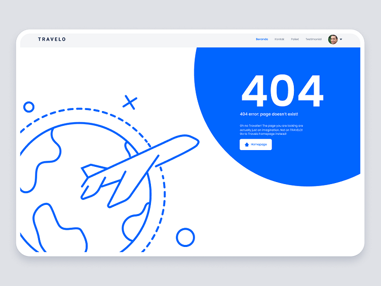
I made a simple travel illustration by drawing a plane going around the world. And put the 404 error message directly where the plane is facing. And then Just use the primary color of the TRAVELO's identity.
With that approach, I can get a design that suit the brand style, user-friendly, and also not excessive.
What do you think? Let me know your thought!
