Omelet Gaming Brand Identity
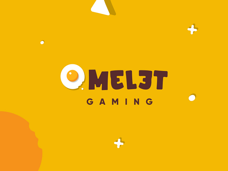
An eggy style brand.
This work was done in-house and I was tasked to create a logo and brand that symbolizes a controller and an egg. My management also highlighted the need for the logo to be whimsical, playful and appealing to kids. They provided the name ‘Omelet Gaming’, and yes omelet isn’t spelt that way but the management seems to think it’s cool.
For the full case study : https://www.behance.net/gallery/136997355/Omelet-Gaming-Branding