Ternary - Branding, Product Design, and Website Case Study
We have been working closely with Ternary to develop their new visual identity, research customer experience, and discover key insights behind the product.
Ternary was created to build a culture of accountability, collaboration, and trust between Finance and Engineering teams. Ternary is the world’s first FinOps native cost optimization tool. Built for Google Cloud on Google Cloud.
We've helped Ternary with a completely new Visual identity, Product Discovery, Website design and development, as well as Product UI Design.
New Visual Identity
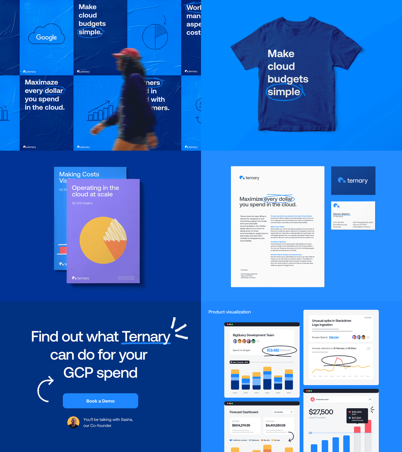
For Ternary’s new identity we faced the challenge of developing a visual language that could communicate trust, accountability, and collaboration, with elements that could feel precise and powerful yet uncomplicated and approachable.
The logo features a simple symbol that brings Ternary’s mission to the forefront: unlocking the full potential of every cloud dollar spent. The wordmark spells the brand name in letters that feel structured and accessible, emphasising both the power and simplicity of the product.
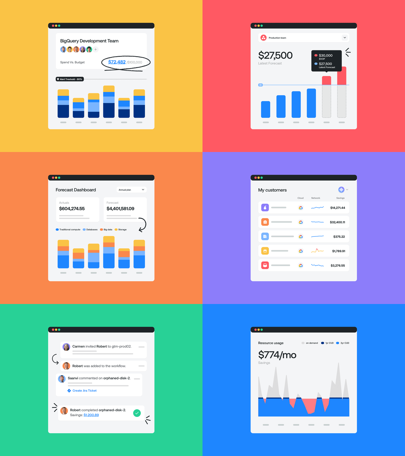
We used Aeonik as the primary typeface as it perfectly combines the precision and structure of a geometric sans-serif, with the humanistic details of a sans grotesk. We also thought of a blue-led colour palette to present Ternary as a trustworthy and respectable brand (to meet the expectations of a powerful financial tool) but paired it with a lively extended color palette to create complex yet accessible data visualisations.
The set of hand-drawn scribbles and arrows highlight keywords and actions throughout the website, accentuating the human and collaborative aspects of the brand.
Ternary - Visual Identity
Hey folks! Happy to share some the work we've done for this FinOps cloud cost optimization tool. We have been working closely with Ternary to develop their new visual identity, research customer experience, and discover key insights behind the product.
New visual identity
For Ternary’s new identity we faced the challenge of developing a visual language that could communicate trust, accountability and collaboration, with elements that could feel precise and powerful yet uncomplicated and approachable.
The logo features a simple symbol that brings Ternary’s mission to the forefront: unlocking the full potential of every cloud dollar spent. The wordmark spells the brand name in letters that feel structured and accessible, emphasising both the power and simplicity of the product.
We used Aeonik as the primary typeface as it perfectly combines the precision and structure of a geometric sans-serif, with the humanistic details of a sans grotesk. We also thought of a blue-led colour palette to present Ternary as a trustworthy and respectable brand (to meet the expectations of a powerful financial tool) but paired it with a lively extended color palette to create complex yet accessible data visualisations. The set of hand-drawn scribbles and arrows highlight keywords and actions throughout the website, accentuating the human and collaborative aspects of the brand.
About Ternary
Ternary was created to build a culture of accountability, collaboration, and trust between Finance and Engineering teams. Ternary is the world’s first FinOps native cost optimization tool. Built for Google Cloud on Google Cloud.
We're looking forward to a continued partnership with Ternary as we discover new ways to improve the product and its marketing environment.
Credits
Big thanks to the Ternary team, including Patrick, Sasha, Chuck, and Josh, for providing incredible insight, guiding us through our collaboration, and trusting BB Agency to deliver a new identity for Ternary.
Also, big thanks to Adrian, Vicente, Louis, Alex, Filip, and Tomislav for researching, ideating, designing, and building the new Ternary brand, website, and product experience.
We are BB Agency
We're a digital agency crafting holistic, people-friendly experiences. We serve as a strategic partner for fast-growing tech companies in need of a scalable website with modular CMS, a design system, and a future-proof brand identity. Through challenging core assumptions, we shape the products and services that improve the lives of thousands every single day.
Check us out at www.bb.agency
Ternary - Branding
Hey there, more amazing shots for the branding work we did for Ternary!
New visual identity
For Ternary’s new identity we faced the challenge of developing a visual language that could communicate trust, accountability and collaboration, with elements that could feel precise and powerful yet uncomplicated and approachable.
The logo features a simple symbol that brings Ternary’s mission to the forefront: unlocking the full potential of every cloud dollar spent. The wordmark spells the brand name in letters that feel structured and accessible, emphasising both the power and simplicity of the product.
We used Aeonik as the primary typeface as it perfectly combines the precision and structure of a geometric sans-serif, with the humanistic details of a sans grotesk. We also thought of a blue-led colour palette to present Ternary as a trustworthy and respectable brand (to meet the expectations of a powerful financial tool) but paired it with a lively extended color palette to create complex yet accessible data visualisations. The set of hand-drawn scribbles and arrows highlight keywords and actions throughout the website, accentuating the human and collaborative aspects of the brand.
About Ternary
Ternary was created to build a culture of accountability, collaboration, and trust between Finance and Engineering teams. Ternary is the world’s first FinOps native cost optimization tool. Built for Google Cloud on Google Cloud.
We're looking forward to a continued partnership with Ternary as we discover new ways to improve the product and its marketing environment.
Credits
Big thanks to the Ternary team, including Patrick, Sasha, Chuck, and Josh, for providing incredible insight, guiding us through our collaboration, and trusting BB Agency to deliver a new identity for Ternary.
Also, big thanks to Adrian, Vicente, Louis, Alex, Filip, and Tomislav for researching, ideating, designing, and building the new Ternary brand, website, and product experience.
We are BB Agency
We're a digital agency crafting holistic, people-friendly experiences. We serve as a strategic partner for fast-growing tech companies in need of a scalable website with modular CMS, a design system, and a future-proof brand identity. Through challenging core assumptions, we shape the products and services that improve the lives of thousands every single day.
Check us out at www.bb.agency
Ternary - Brand application
We have been working closely with Ternary to develop their new visual identity, research customer experience, and discover key insights behind the product.
New visual identity
For Ternary’s new identity we faced the challenge of developing a visual language that could communicate trust, accountability and collaboration, with elements that could feel precise and powerful yet uncomplicated and approachable.
The logo features a simple symbol that brings Ternary’s mission to the forefront: unlocking the full potential of every cloud dollar spent. The wordmark spells the brand name in letters that feel structured and accessible, emphasising both the power and simplicity of the product.
We used Aeonik as the primary typeface as it perfectly combines the precision and structure of a geometric sans-serif, with the humanistic details of a sans grotesk. We also thought of a blue-led colour palette to present Ternary as a trustworthy and respectable brand (to meet the expectations of a powerful financial tool) but paired it with a lively extended color palette to create complex yet accessible data visualisations. The set of hand-drawn scribbles and arrows highlight keywords and actions throughout the website, accentuating the human and collaborative aspects of the brand.
About Ternary
Ternary was created to build a culture of accountability, collaboration, and trust between Finance and Engineering teams. Ternary is the world’s first FinOps native cost optimization tool. Built for Google Cloud on Google Cloud.
We're looking forward to a continued partnership with Ternary as we discover new ways to improve the product and its marketing environment.
Credits
Big thanks to the Ternary team, including Patrick, Sasha, Chuck, and Josh, for providing incredible insight, guiding us through our collaboration, and trusting BB Agency to deliver a new identity for Ternary.
Also, big thanks to Adrian, Vicente, Louis, Alex, Filip, and Tomislav for researching, ideating, designing, and building the new Ternary brand, website, and product experience.
We are BB Agency
We're a digital agency crafting holistic, people-friendly experiences. We serve as a strategic partner for fast-growing tech companies in need of a scalable website with modular CMS, a design system, and a future-proof brand identity. Through challenging core assumptions, we shape the products and services that improve the lives of thousands every single day.
Check us out at www.bb.agency
Ternary - Guidelines
Hey folks, sharing here some pages of the guidelines we developed for Ternary.
New visual identity
For Ternary’s new identity we faced the challenge of developing a visual language that could communicate trust, accountability and collaboration, with elements that could feel precise and powerful yet uncomplicated and approachable.
The logo features a simple symbol that brings Ternary’s mission to the forefront: unlocking the full potential of every cloud dollar spent. The wordmark spells the brand name in letters that feel structured and accessible, emphasising both the power and simplicity of the product.
We used Aeonik as the primary typeface as it perfectly combines the precision and structure of a geometric sans-serif, with the humanistic details of a sans grotesk. We also thought of a blue-led colour palette to present Ternary as a trustworthy and respectable brand (to meet the expectations of a powerful financial tool) but paired it with a lively extended color palette to create complex yet accessible data visualisations. The set of hand-drawn scribbles and arrows highlight keywords and actions throughout the website, accentuating the human and collaborative aspects of the brand.
About Ternary
Ternary was created to build a culture of accountability, collaboration, and trust between Finance and Engineering teams. Ternary is the world’s first FinOps native cost optimization tool. Built for Google Cloud on Google Cloud.
We're looking forward to a continued partnership with Ternary as we discover new ways to improve the product and its marketing environment.
Credits
Big thanks to the Ternary team, including Patrick, Sasha, Chuck, and Josh, for providing incredible insight, guiding us through our collaboration, and trusting BB Agency to deliver a new identity for Ternary.
Also, big thanks to Adrian, Vicente, Louis, Alex, Filip, and Tomislav for researching, ideating, designing, and building the new Ternary brand, website, and product experience.
We are BB Agency
We're a digital agency crafting holistic, people-friendly experiences. We serve as a strategic partner for fast-growing tech companies in need of a scalable website with modular CMS, a design system, and a future-proof brand identity. Through challenging core assumptions, we shape the products and services that improve the lives of thousands every single day.
Check us out at www.bb.agency
Ternary - Branding
Hey there, more amazing shots for the branding work we did for Ternary!
New visual identity
For Ternary’s new identity we faced the challenge of developing a visual language that could communicate trust, accountability and collaboration, with elements that could feel precise and powerful yet uncomplicated and approachable.
The logo features a simple symbol that brings Ternary’s mission to the forefront: unlocking the full potential of every cloud dollar spent. The wordmark spells the brand name in letters that feel structured and accessible, emphasising both the power and simplicity of the product.
We used Aeonik as the primary typeface as it perfectly combines the precision and structure of a geometric sans-serif, with the humanistic details of a sans grotesk. We also thought of a blue-led colour palette to present Ternary as a trustworthy and respectable brand (to meet the expectations of a powerful financial tool) but paired it with a lively extended color palette to create complex yet accessible data visualisations. The set of hand-drawn scribbles and arrows highlight keywords and actions throughout the website, accentuating the human and collaborative aspects of the brand.
About Ternary
Ternary was created to build a culture of accountability, collaboration, and trust between Finance and Engineering teams. Ternary is the world’s first FinOps native cost optimization tool. Built for Google Cloud on Google Cloud.
We're looking forward to a continued partnership with Ternary as we discover new ways to improve the product and its marketing environment.
Credits
Big thanks to the Ternary team, including Patrick, Sasha, Chuck, and Josh, for providing incredible insight, guiding us through our collaboration, and trusting BB Agency to deliver a new identity for Ternary.
Also, big thanks to Adrian, Vicente, Louis, Alex, Filip, and Tomislav for researching, ideating, designing, and building the new Ternary brand, website, and product experience.
We are BB Agency
We're a digital agency crafting holistic, people-friendly experiences. We serve as a strategic partner for fast-growing tech companies in need of a scalable website with modular CMS, a design system, and a future-proof brand identity. Through challenging core assumptions, we shape the products and services that improve the lives of thousands every single day.
Check us out at www.bb.agency
New Website and Product Design
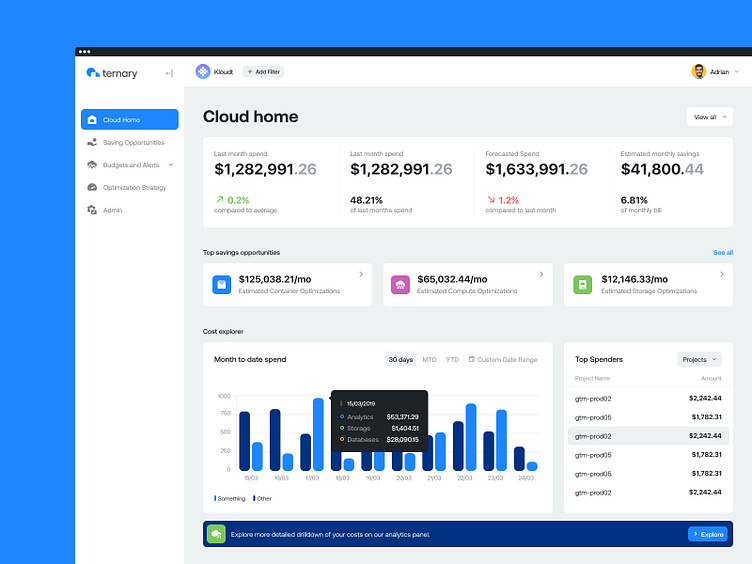
One of the primary focuses for the new Ternary experience was defining a modern and consistent design language that would be easily applicable to both the marketing and product environments.
Ternary team knew that they wanted to build a design-led product that would allow them to elevate their offering and marketing efforts compared to their competitors. With a strong focus on overall user experience and design quality, it was an easy task for BB's UX and UI teams to deliver a digital experience that is consistent through all the brand touchpoints.
The new design language establishes Ternary as a serious contender within the industry and allows future growth and expansion both on the product and marketing front.
Results
Big thanks to the Ternary team, including Patrick, Sasha, Chuck, and Josh, for providing incredible insight, guiding us through our collaboration, and trusting BB Agency to deliver a new identity for Ternary.
Also, big thanks to Adrian, Vicente, Louis, Alex, Filip, and Tomislav for researching, ideating, designing, and building the new Ternary brand, website, and product experience.
You can check the live website here.
We are BB Agency
We're a digital agency crafting holistic, people-friendly experiences. We serve as a strategic partner for fast-growing tech companies in need of a scalable website with modular CMS, a design system, and a future-proof brand identity. Through challenging core assumptions, we shape the products and services that improve the lives of thousands every single day.
Check us out at www.bb.agency


