The Gathering - A New Face for a Philanthropic Conference
The Gathering approached Whiteboard to help them revamp their identity as their organization matured and grew beyond their annual conference to include more offerings. Their goals were to:
Make the brand feel sophisticated, but not ostentatious.
Highlight their high-value content and set the stage for their thought leadership.
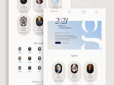
In expanding the brand into the website, I loved the idea of the table shape. The Gathering literally started around a kitchen table and it continues to be a metaphor for how they want to create safe spaces to talk bout philanthropy.
The footer has to be my favorite example of this. I added borders around the edges to look like inlays.
I also like the speakers section on the conference page and how the speakers are almost arranged as if they're seated around a table.
Identity Design: Shammer Diaz
Website Design: myself
Creative Direction: Kody Dahl


