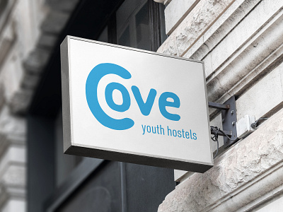
Cove - Youth Hostel Brand Exploration
Cove* is a new youth hostel and safe space opening up in the heart of London. The non-profit works with teenagers and young adults who are either homeless, in between housing or looking for support to get away from a life of crime or abuse.
Initially setup as a support forum and online resource platform by its founder, Cove has gradually become a community anchor, and is now seen as a vital support network for young adults who are being led down a path of crime and substance misuse.
For this project I wanted to convey community, safety and support. A cove is a small bay which could be used to shelter from the sea. I took this idea and started developing concepts around it. After several iterations I settled on the idea that the C in the word cove, is shaped like a cove, and is sheltering a group/community of the other 3 letters. I gave the logo a more hand-drawn look so that it looks welcoming and friendly. Once I had the logo completed, I looked for colours that would be bold, but welcoming. Finally, I paired the logo with a bold, but condensed sans-serif typeface, which can be used to make the branding disruptive as specified in the brief.
*This is a personal project based on a brief from the brief box.


