Peep - Sunglasses brand exploration
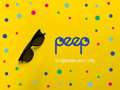
Peep* is an up and coming glasses brand based in Brighton, UK. Peep prides itself on promoting diversity and uniqueness through wacky frames and colours to suit anyone and everyone. Their slogan is ‘Sunglasses your way’, which evokes a feeling a self expression and customisation.
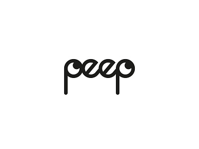
For this project I wanted to convey the fun aspect of the brand through the use of colours. I used the p in the name to loosely resemble a pair of glasses with the stem being the arm of the glasses and added cheeky pupils to make eyes, so the logo is 'peeping' at you. I went through many iterations of the logo to get it balanced and looking clean, whilst still retaining a touch of fun. Once I had got the logo completed, I worked on a colour scheme which evokes feelings of summer, diversity and uniqueness using bright colours. I made a pattern to be used across the branding, and the colours can be interchangeable as either background colours or used in the pattern. This gives the brand flexibility for different looks for their advertising and other marketing collateral.
I had a lot of fun working on this one and learned a lot too. It's always great to learn something on every project and further refine my process each time.
*This is a personal project based on a brief from @thebriefbox.


