Skin tones and Colors
This Case Study is a repost from my Instagram Post 1 | 2
This Case Study is my personal approach for the project in the company I'm working for. Absolutely, it might be different with your case. Wise advice to not take this case as a standard for you to make any decisions on your design. I'm still learning, will update this if I find something interesting in the future. Feel free to keep in touch with me on Instagram)
Background
After continuously drawing illustrations for a few months, there was a time when I sat back and evaluated all of the illustrations and talk to myself about them.
Later I found out the illustration color palette was fighting with the primary button for the main attention.
The contrast was messy, and I feel bad to create only one type of skin tone.
I checked the contrast of all the illustrations by changing them into monochrome. I see myself enjoyed read Aaron Tenburen's article on Medium about Designing For (and With) Color Blindness.
By reading the article I got so many insights about the matter of color blindness, its impact on designers, and also discuss the success app for color blindness and the mistakes that hopefully we could prevent.
📌 Did you know? You can heck the grayscale on Figma or Adobe Illustrator only need two simple steps: First, draw a white square above the illustration. Second, change the square blending layer into Color, Hue, or Saturation options! That's how I checked my grayscale contrast. After done with the contrast I usually hide the square layer or put it far away ✌🏼
Using the color-blind simulator, I’m trying to understand more about the way people see the illustrations on screen through monochromatic colors.
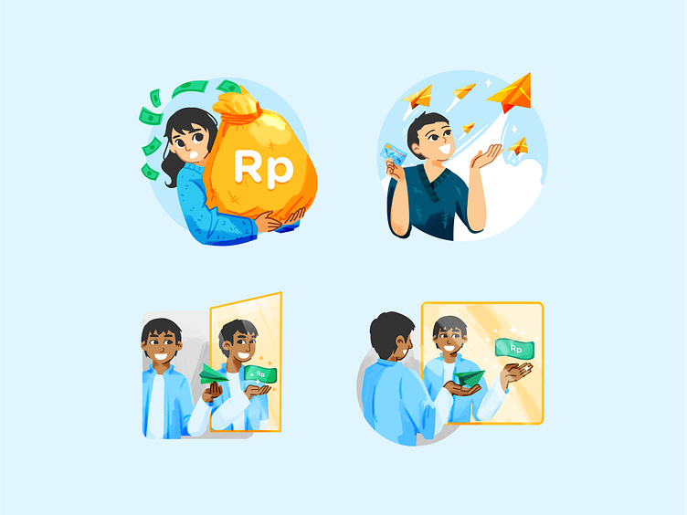
The first version of the illustration was using Primary and Secondary colors too much. For the next version, Illustration gets more cool colors to give the highest attention to the primary button. The main goal was to create less distraction.
Skin Tones🎉
After self-reflection, I decided to change the skin color palette in to become more inclusive wider-range Asian skin tones. I got the names from ‘foundation (makeup) products 💄
I also experiment a bit with the previous version illustration to try out new skin tones. I still tried many attempts until I was confident enough to apply the new skin pallets into the upcoming version of the illustrations. I will upload more soon!


