Node workflow designer | UI controls
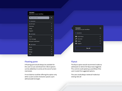
Exploring options for how a user could add more nodes to their workflow. It's part of my 'triathlon insights' side-project. As the user is building out a journey or flow, they need to quickly be able to add, edit, or delete nodes. I'm starting with a small base set of nodes and am thinking of ways to optimize the available screen real-estate.
The Floating pane is a great option when the user wants to see everything available to them. The Flyout has a much smaller footprint but doesn't show the entire toolbox. Instead, it would have to be more intelligent, only offering nodes that 'make sense' to add in the specific trigger area.
---------
Find me on: Instagram | Twitter | Behance | LinkedIn | Uplabs
More by Tyler Wain View profile
Like
