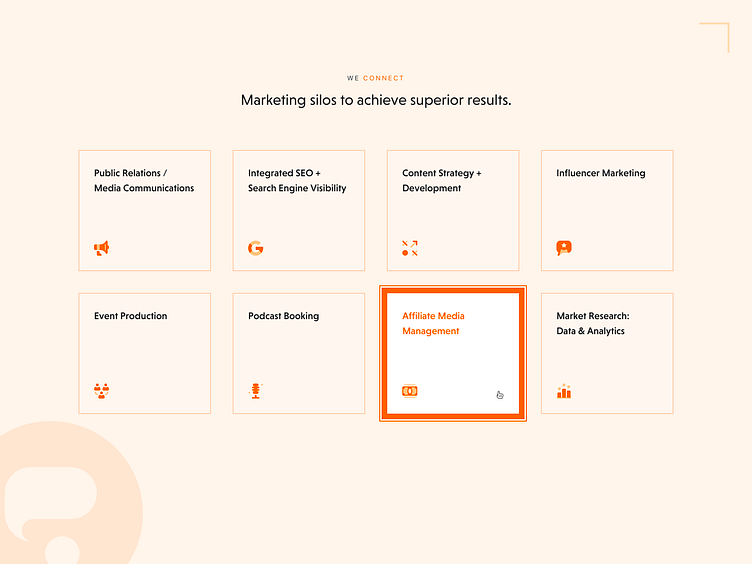
Purple Orange Marketing Site - Services Section UI
When re-designing Purple Orange's marketing site, it was important to maintain a bold, yet minimal aesthetic. The hover state of the cards in the Services section served dual purpose - clearly indicate that this particular element is clickable, as well as present a contrasting bold border width only when a specific element is in focus, otherwise leaving the minimalist aesthetic in tact.
More by Max Burnside [Available for projects] View profile
Like
