Web Design UI kit
Hi there 👋
Are you tired of wasting thousands of hours starting from scratch on every project and rebuilding the same components? Create beautiful designs for web applications with a powerful Web UI kit.
Includes
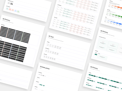
26 categories of components
Button, Text field, Drop-down, Date picker, Time picker, Number input, Text area, Rich text box, Data picker, Selector control, Tab, Segmented control, Tooltip, Counter, Toast, Tag, Accordion, Data table, Pagination, Breadcrumb, Progress bar, Upload files, Wizard, List, Icon, Image.
More than 2000 components
They all support variants and are auto-layout-based with a smart, scalable typography system.
Interactive components
Interactive components create prototype interactions between variants in a component set. This saves time when creating prototypes and prevents unnecessary noodle soup.
Color styles
Thirty-seven color styles can be applied to fills, strokes, backgrounds, and text.
Typography styles
The typography system based on IBM Plex Sans includes a range of contrasting styles that support the needs of your product and its content.
Links
🔗 Preview version on Figma Community
🔗 Full version on Gumroad
______________________________________________
🇺🇦 I support Ukraine ❤️ 90% of all sales will be donated to humanitarian aid to Ukrainians affected by Russian aggression.